Quantcast
Channel: Enfold Documentation
Viewing all 80 articles
Browse latest View live

Search

$
0
0

Search

Polylang Ajax Search Filter

This is a Code snippet for polylang plugin users who want to filter the search results in the ajax search based on the current language. Add this to your themes or child themes function.php file

/**
 * Ajax Search Query
 */
 
add_filter('avf_ajax_search_query', 'avf_modify_ajax_search_query', 10, 1);
function avf_modify_ajax_search_query($search_parameters)
{
$language = pll_current_language();
parse_str($search_parameters, $params);
$params['lang'] = $language;
$search_parameters = http_build_query($params);
return $search_parameters;
}

* Forum reference

Use SearchWP instead of the standard search

SearchWP is an advanced search engine for WordPress. You can use it with Enfold without any additional configuration. If you want to use it with the ajax search function (preview search results when you click on the magnifier icon) then insert this code into the child theme functions.php file or into the enfold/functions.php file:

add_filter( 'avf_ajax_search_function', 'avia_init_searchwp', 10, 4 );

function avia_init_searchwp( $function_name, $search_query, $search_parameters, $defaults ) {
	$function_name = class_exists( 'SearchWP' ) ? 'avia_searchwp_search' : $function_name;
	return $function_name;
}

function avia_searchwp_search( $search_query, $search_parameters, $defaults ) {
	$searchwp = SearchWP::instance();
	$engine_name = 'default'; // you can swap in your Supplemental Search Engine name
	parse_str( $search_query, $output );
	$search_string = isset( $output['s'] ) ? sanitize_text_field( urldecode( $output['s'] ) ) : '';

	// limit the results to 5
	function avia_searchwp_search_num_results() {
		return 5;
	}
	add_filter( 'searchwp_posts_per_page', 'avia_searchwp_search_num_results' );

	$posts = $searchwp->search( $engine_name, $search_string );
	return $posts;
}

Troubleshooting

In case you get 404 error on your archive pages, please try de-activating SearchWP plugin and check if it is the culprit. If it is, please add following code to Functions.php file as well


function my_searchwp_maybe_short_circuit() {
	if ( is_archive() ) {
		add_filter( 'searchwp_short_circuit', '__return_true' );
	}
}

add_action( 'wp', 'my_searchwp_maybe_short_circuit', 999 );

Use Relevanssi in search instead of the default search

If you are using Relevanssi for your WordPress searches you can have the theme use it as well for the non-standard search forms that the theme generates.

add_filter('avf_ajax_search_function', 'avia_init_relevanssi', 10, 4);
function avia_init_relevanssi($function_name, $search_query, $search_parameters, $defaults)
{
    $function_name = 'avia_relevanssi_search';
    return $function_name;
}

function avia_relevanssi_search($search_query, $search_parameters, $defaults)
{
    global $query;
    $tempquery = $query;
    if(empty($tempquery)) $tempquery = new WP_Query();

    $tempquery->query_vars = $search_parameters;
    relevanssi_do_query($tempquery);
    $posts = $tempquery->posts;

    return $posts;
}

Customize schema.org markup

[alert style=”info”]Attention – this tutorial is intended for advanced php/wordpress developers who know what they’re doing. If you’re not familiar with schema.org markups and/or wordpress hooks please do not mess around with the code.[/alert]

With Enfold 2.0 we introduced modern html5 and schema.org markup which is used with the theme framework and template builder. The markup helps you to improve the search engine ranking – for more information refer to: Schema.org. However we know that some advanced coders and seo experts might want to fine tune the schema.org markup and thus we created the markup feature with flexibility and customization options in mind.

This article will show you all hook and options  which help you to customize the markup output.

1) Options:

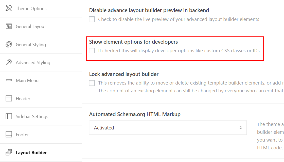
Since Enfold 2.7.1 we added an “Automated Schema.org HTML Markup” dropdown to the theme option page. Go to Enfold > Theme Options and select “Not activated” if you want to deactivate the schema.org markup on the entire website. By default it’s activated.

2) Hooks:

If you want to customize the schema.org markup I recommend to study the markup function code in enfold\includes\helper-markup.php. You’ll notice 3 filters, namely “avf_markup_helper_args”, “avf_markup_helper_attributes” and “avf_markup_helper_output”.

a) “avf_markup_helper_args” filter

This filter enables you to change the arguments which are passed to the the markup generation function. By default 5 arguments are supported –

'context' => '',
'echo' => true,
'post_type' => '',
'id' => '',
'custom_markup' => '',
'force' => false

The “context” argument determines which markup will be used for the current element (please study the switch function to learn which context triggers a certain markup), the “echo” argument is self explaining, the “post_type” argument can contain the current post type. If it’s not set you can use the get_post_type() function to fetch the post type from the main query. The same thing applies to the “id” argument which is only set if the markup function is called within a custom query. If it’s a single post/page use the get_the_ID() function to fetch the id of the current post/page.

The “custom_markup” argument is not used (and set) by default but you can use it to overwrite our default markup with your custom schema.org markup. Note that this parameter is only powerful if you use it in combination with some other hooks. Eventually it enables you to overwrite the markup for each template builder element (and subelement) if necessary. I.e. you can use the “avf_template_builder_shortcode_elements” filter to add a new input field to the shortcode/template builder and then pass the content of the “markup” input field with the “custom_markup” argument to the markup function. I recommend to study the sample code at the end of this article to understand how this filter can be used. If you’re still not sure how it works I recommend to paste the code into a child theme functions.php file and then go to the template builder option page to test it on your own.

The “force” argument enables you to activate the markup for certain elements even if the user deactivated the markup (see 1) ) feature on the theme option page.

b) “avf_markup_helper_attributes” filter

This filter enables you to register new attributes (i.e. for a new, custom context) or to overwrite the content of existing attributes. I.e. if you want to remove the markup for the “phone” context insert this code into the child theme functions.php file:

add_filter('avf_markup_helper_attributes','avia_change_schema_attributes', 10, 2);
function avia_change_schema_attributes($attributes, $args)
{
	if($args['context'] == 'phone')
	{
		unset($attributes);
	}

	return $attributes;
}

You can also overwrite the content of an attribute:


add_filter('avf_markup_helper_attributes','avia_change_schema_attributes', 10, 2);
function avia_change_schema_attributes($attributes, $args)
{
	if($args['context'] == 'author_name')
	{
		$attributes['itemscope'] = 'creator'; //default value is $attributes['itemprop'] = 'name';
	}

	return $attributes;
}

c) “avf_markup_helper_output” filter

This filter enables you to manipulate the final output. Note it’s a text string, thus I recommend to use the other filters for the markup customization. This filter is useful for prefix/suffix text and final text replacements.

add_filter('avf_markup_helper_output','avia_change_schema_output', 10, 2);
function avia_change_schema_output($markup, $args)
{
	//manipulate $markup code
	return $markup;
}

d) Advanced example code

This code will add a new input field to all shortcode option windows which enables you to overwrite the default markup with a custom schema.org markup. Note that the input field does not validate your markup nor does it check if the context makes sense for the current element or not. This code is just a “starting point” for developers who want to build an advanced markup ui for their clients based on our Enfold theme framework.

/*
Add new input option field to the shortcode option windows. Also include sub-element option windows in case a custom markup is required for image slides, content slides, etc.
*/

add_filter('avf_template_builder_shortcode_elements','avia_custom_markup_element', 10, 2);
function avia_custom_markup_element($elements, $config)
{
	$elements[] = array(
		"name" => __("Custom Schema.org Markup Context",'avia_framework' ),
		"desc" => __("Set a custom schema.org markup context",'avia_framework' ),
		"id" => "custom_markup",
		"type" => "input",
		"std" => "");

	foreach($elements as $key => $data)
	{
		if(!empty($data['subelements']))
		{
			$elements[$key]['subelements'][] = array(
			"name" => __("Custom Schema.org Markup Context",'avia_framework' ),
			"desc" => __("Set a custom schema.org markup context",'avia_framework' ),
			"id" => "custom_markup",
			"type" => "input",
			"std" => "");
		}
	}

	return $elements;
}

/*
Check if the custom_markup option is set. If yes store it into the §meta variable to pass it to the shortcode handler
*/
add_filter('avf_template_builder_shortcode_meta', 'add_markup_to_meta', 10, 4);
function add_markup_to_meta($meta, $atts, $content, $shortcodename)
{
	$meta['custom_markup'] = isset($atts['custom_markup']) ? $atts['custom_markup'] : '';
	return $meta;
}

/*
Check if the custom_markup option is set. If yes store it into the §meta variable to pass it to the shortcode handler
*/
add_filter('avf_markup_helper_args','print_args_schema_org', 10, 1);
function print_args_schema_org($args)
{
	if(!empty($args['custom_markup']))
	{
		$args['context'] = $args['custom_markup'];
	}

	if($args['context'] == "no_markup") $args['context'] = false;

	return $args;
}

Now you can use the input field to change the default markup context to a custom context. The input field content is stored for each shortcode – thus you can also modify the context for each shortcode individually. The sample code above i.e. enables you to remove the markup from a certain shortcode. Just type in “no_markup” into the input field and the markup will be removed from the shortcode.


Translation

$
0
0

Translation

How to translate pages built with Enfold using WPML

Enfold is fully compatible with WPML and you can use WPML to turn your site into a multilingual one in minutes.

You can check out video tutorial below or head over to WPML documentation for more in depth instructions and start translating your site right away!

The tutorial video shows an easy way to translate pages directly from the WPML interface. As an alternative you of course always have the option to create a second page with WordPress and set it as a translation to the first page. This allows more flexibility and you can provide different layout structures for a translation, but lacks the convenience that when you edit the  layout on one page that it also changes on all translations. It’s entirely your choice to decide which method you prefer 😉

New WPML feature, Display as translated

WPML introduces a new translation mode called – display as translated – which is compatible with Enfold and invaluable for developers using Enfold demos.

About the display as translated feature:

  • Users can show original content if no translation is available.
  • Users can display untranslated content without the need to duplicate it anymore.
  • Useful for sites that don’t need to translate everything: listing, directory and membership sites as well as WooCommerce products and taxonomies.

Example:

Let’s say we have a real estate site and we don’t want to translate all the post types belonging to “properties”.

Thanks to this new mode, we can have 98% of our page translated to Spanish but still containing some content in English without duplicating it:

To sum up:

  • If the translation exists = it will display the translation.
  • If the translation does not exist = it will display the post in the site default language.

How to enable this new translation mode for the post types of your choice:

  1. Go to WPML > Translation Management > Multilingual Content Setup
  2. Scroll down to Post Types Translation
  3. Select “Translatable – use translation if available or fallback to original language” option for the post types of your choice.

Child Theme Translations

In case you want to modify something in an Enfold translation you can do it by directly editing the translation file. However, if you update the theme these modifications will be lost. To avoid this, it is recommended to use a child theme approach, here’s how to do it.

Step 1

Create a /lang/ folder in your child theme directory and copy (from the parent theme) the translation files to be modified:

Step 2

Add the following to your child theme functions.php file:

function overwrite_language_file_child_theme() {
    $lang = get_stylesheet_directory().'/lang';
    return $lang;
}
add_filter('ava_theme_textdomain_path', 'overwrite_language_file_child_theme');

Now the translations found in your child theme /lang/ folder will be loaded instead.

Translating the portfolio slug with WPML

Since Enfold 2.4.4 we use the _x() function to translate the portfolio post type slugs. It’s the default (and recommended) solution to translate post type slugs with WPML. Please note that you must install the String Translation extension first – otherwise you can’t translate the slug(s).

After you installed both plugins and Enfold go to the WordPress Dashboard (admin screen) and select “WPML” > “Translation options” from the sidebar menu. A new option page will load – search for the “Translate custom posts slugs (via WPML String Translation).” checkbox and tick it (=activate this setting). Then click the blue “Save” button.

Afterwards search for the “Custom post types” option field on the same option page. It will look like:

Note that you need to tick the checkbox below “Portfolio Items” – otherwise you won’t see the slug translation options for the post type. WPML enables you to translate the slug for each registered language except the standard language. Enter your custom text/translation into the text field(s) and then save the settings.

Eventually select “Settings” > “Permalinks” from the sidebar menu. You’ll notice a “Portfolio Entry Settings” section near the bottom of the permalink option page which enables you to change the slug for the standard language. By default the “Portfolio Items Base” option is set to “portfolio-item” and the “Portfolio Categories Base” is set to “portfolio_entries”. You can replace the default values with some custom text – however you must not use special characters or spaces.

Last but not least save the permalink settings by clicking the “Save Changes” button. Please save the permalink settings even if you didn’t change the default slug rules because the saving process forces WordPress to clear/flush the slug rewrites rules.

Example of custom size fullscreen slider

Example of Using categories to style masonry blog grid

Typography

$
0
0

Typography

Overview

Enfold makes it easy to have a consistent typography across the site. By default enfold comes loaded with many websafe and google fonts, for some reason if you need to use a custom font that suits your design or to comply with GDPR. With the release of Enfold 4.4 users can now upload any custom fonts or google fonts from Enfold theme options 😉

Common fonts like body, p, strong, headings, menu, buttons and titles can be changed from Enfold > Advanced styling.

General font options

A quick look at font options to change font family, size and color for common elements such as body, paragraph, menu items, titles, headings, etc. Font styles can be separately applied to different sections such as the logo area, content area, footer, primary and secondary sections.

Color of the elements in the below groups can be changed from Enfold > General Styling >  Select a section like a logo area, footer, etc.

  • Primary group: Consist of elements such as active menu item, menu hover, strong tag, button color, content links, footer links, drop caps.
  • Secondary group: will affect blockquotes, form placeholder text, widgets, widget titles, pagination, playlist time and meta content of elements like the team members, blog post etc.
  • Highlight group: is made up of link hover color in the content area, links in meta content, footer,  button color on hover, etc.

Body Font

Default font family, size and color  for content sections like body, paragraph, etc can be changed from

Body font family:
Enfold > General Styling > Fonts > Font for your body text

Body font size:
Enfold > General Styling > Fonts > Default content font size

Body font color:
Enfold > General Styling > Main Content > Main Content font color

To add your own custom style to the body text like may be a text shadow or other effects it can be done using custom CSS. The CSS selectors you can use are:

body {
/* Your styles here */
font-size: 14px;
}

Paragraph text

Paragraph font color: By default, paragraph text inherits the body font color set in the theme options. Unique color can be applied to the paragraph text from the text block element pop up options. Color set in the text block element options will override the default color applied to paragraph text by the theme.

Paragraph font size: Paragraph inherits the body font size by default but as you already know that a different color can be set individually. Font size of the paragraph can also be changed individually for each paragraph text and this will override the default font size set in the theme options.

Strong

Strong font color: Strong tag is a part of primary element group and it inherits the primary color set in the theme options under Enfold > General Styling > Main Content > primary color

Alternatively, the strong color can also be changed sitewide using the below custom CSS:

.main_color strong, .alternate_color strong { color: blue; }

Blockquotes

Blockquotes color: Blockquotes is grouped as a secondary element and it inherits the secondary color set in the theme options under:
Enfold > General Styling > Main Content > secondary color.

Other styles: Styles set in Advanced styling will override the secondary group style. Advanced styling gives more customization options like border, font size etc along with color it can be accessed from:
Enfold > Advanced styling > Blockquotes

Alternatively, custom CSS style can be applied to fully customize the blockquotes. The below element has a custom CSS class “blockquote-style-1” applied to it:

It is always the simple that produces the marvelous.

Code Snippet:


/*----------------------------------------
// Blockquotes
//--------------------------------------*/

#top .main_color blockquote.blockquote-style-1{
  font-family:Open Sans;
  font-style:italic;
  color: #FFF;
  padding:25px 15px 15px 30px;
  border-left:8px solid #537b35 ;
  background:#2dde98;
}


List

A text-based List can be created using the list icon in the text editor. A list item inherits the default color and size set for the body font.  However, the font color and size can be changed in the text block option similar to the paragraph text.

Link text

A text link in a paragraph, widget area or blog posts is part of the primary element group. We can assign a different link color for each section (Logo area, Main content, Alternate content or Footer area) from the theme options.
Enfold > General Styling > Select the content area and update the Primary Color and Highlight Color ( Highlight color affect the hover color of the links).

Heading Fonts

  • If the headings are created using the text editor the headings will inherit the body font color.
  • If the headings are created using the “Special heading” element the color set in the theme options will be applied sitewide.
    Enfold > General Styling > Main Content > Main Content Heading color

    The special heading element has an option to select a different pre-styled heading and customize margins, paddings and color.

Main Menu

For a detailed overview of the menu items and styling options please visit the menu section.

Buttons

For more details and styling options available for buttons please visit the button section.

Dropcaps

Drop caps can be inserted using the magic wand shortcode tool or you can directly use the shortcode in the text editor.

Hello I’m a simple drop cap. Letraset sheets containing Lorem passages, and more recently with desktop publishing software like Aldus PageMaker including versions of Lorem Ipsum.

I am a drop cap with background color. More recently with desktop publishing software like Aldus PageMaker including versions.

Code snippets:

Shortcode

Dropcap Custom Style

Drop cap element can be custom styled using the CSS code. You can add text shadow backgrounds and border style to decorate it as per your needs. To begin with, add the custom class in the drop cap shortcode custom_class=”av-dropcap-style-1″.

Whatever your budget and whatever the size of car you are looking for, we are sure we can help you find what’s right for you. We sell new and used cars from Pollos to Porchas. To fully appreciate the range of cars we have on offer please visit one of our showrooms.

Code snippets:

Shortcode

[avia_codeblock_placeholder uid="0"]

CSS


/*----------------------------------------
// CSS - Drop caps style -1 
//--------------------------------------*/

 .av-dropcap-style-1.av_dropcap1 {
color:#ff4c4c;
font-size:5em;
line-height:80%;
padding-right: .05em;
font-family: Raleway, sans-serif;
font-weight: 800;
text-transform:uppercase;
text-shadow:.025em .030em 0 #fbb034;
}

Customization

How to use code snippets?

  • Add the CSS code in Enfold > General Styling > Quick CSS or in your child theme styles. Some CSS code may require you to turn on custom CSS class name support.
  • Add JS, PHP or filters and hooks in functions.php which can be accessed via WP Dashboard > Appearance > Editor > Theme Functions (functions.php) or use a FTP client and locate the functions.php file in wp-content\themes\enfold-child\functions.php
  • Add shortcodes to widget area, text content area or in page editor debug mode.

How to upload custom fonts

Custom font uploader is one of the major additions to Enfold version 4.4. As the name say’s, Custom font uploader makes it very easy to upload the fonts from your computer to your website and use it in compliance with GDPR. Let us look at some key points related to using self-hosted fonts.

Supported Font Formats

The font formats supported by the Custom Font Manager are listed below:

  • ttf
  • eot
  • woff
  • woff2
  • svg

Optimizing fonts

To use a font which is very heavy on loading or a font may exist in “otf”  or other non-supported formats, we need to first convert the “otf” font to a supported format such as “woff” or “woff2”  using a font kit generator.

  • Upload the “otf” fonts and generate the font kit.
  • Download the font kit and extract the “woff” and “woff2” files.

File structure

For the uploaded fonts to work correctly please follow the file/folder structure as mentioned below.

  • Do Not Add subdirectories.
  • Do Not Add CSS or HTML files.
  • Do Not Add non-supported font formats.
  • Do Not Add multiple font families in one folder.
  • Do Not Add ttf, woff or other uncompressed fonts directly to the theme.

Note: To proceed further you should have the font files in the supported format as mentioned above.

Uploading one font at a time:

In a typical case, we have to upload:

  • my-font-1.ttf
  • my-font-2.ttf
  • my-font-3.ttf

Compress each font as a separate zip file: Right click on my-font-1.ttf and select compress or zip option to generate a compressed file my-font-1.zip repeat this step for the rest of the fonts till you have.

  • my-font-1.zip
  • my-font-2.zip
  • my-font-3.zip

Uploading multiple fonts: Each font and its variants should be in its own folder.

In the below example we have placed each font and its variants in separate folders:

  • my-font-1 ( Folder )
    • my-font-1-regular.ttf
    • my-font-1-thin.ttf
    • my-font-1-light.ttf
    • my-font-1-bold.ttf
  • my-font-2 ( Folder )
    • my-font-2-regular.ttf
    • my-font-2-light.ttf
    • my-font-2-bold.ttf
  • my-font-3 ( Folder )
    • my-font-3-thin.ttf
    • my-font-3-light.ttf
    • my-font-3-bold.ttf

To upload the above fonts at once, select all the font folders (my-font-1, my-font-2, my-font-3) and compress it. Give the compressed file any name of your choice, for example, project-fonts.zip  The zip file is now ready to upload.

NOTE: Do not add the font folders in one main folder as this will create sub-directories and it is not a supported format.

Naming conventions

You only have to follow the naming conventions used by Google: “_” or “-” are interpreted as space.

Managing font variants

There are a couple of ways to upload and manage font variants. In the first method, the variants will be auto-selected by the theme stylesheet. In the second method, we can manually assign the font variants to a specific element of the theme.

Method 1: Auto-assign variants

In this method, a folder containing font variants is compressed and uploaded. The font variants will be auto-assigned by the theme stylesheet. Let’s take Roboto font family as an example and below is the file structure in which it needs to be uploaded.

  • Roboto.zip (Compressed folder containing font variants)
    • Roboto-thin.ttf
    • Roboto-light.ttf
    • Roboto-medium.ttf
    • Roboto-regular.ttf
    • Roboto-bold.ttf
    • Roboto-black.ttf

Upload the Roboto font family as a single zip file from Enfold > Import/Export > Custom font manager the font upload page will refresh and display the font family with its variants.

When Roboto font family is assigned as a default font from Enfold > General Styling > Fonts tab the font weight is auto-assigned to body and headings by the theme stylesheet.

Method 2: Manually assign font variants

This method is recommended if you do not have a lot of fonts, each font variant is compressed and uploaded separately so that we can manually assign the font variants to any element of the theme. Let’s take Roboto font family as an example and below is the file structure in which it needs to be uploaded.

  • Roboto-thin.zip
  • Roboto-light.zip
  • Roboto-medium.zip
  • Roboto-regular.zip
  • Roboto-bold.zip
  • Roboto-black.zip

Upload each of the Roboto family variants as a single zip file from Enfold > Import/Export > Custom font manager the font upload page will refresh every time and display the font variants as seen below.

Now we can assign each of the font variants of the Roboto family to any specific element of the theme from
Enfold > General Styling > Fonts
Enfold > Advanced Styling > Select any element

Uploading the fonts is pretty straightforward.

  • Download and prepare your fonts (please see file structure for more info).
  • Compress the folder/file in zip format and upload to Enfold > Import/Export > Custom Font Manager.
  • After successfully adding new fonts in the correct format, the upload page will reload and display the font family.
  • The uploaded font should show in the Custom uploaded fonts list where ever font family can be assigned like under  Enfold > General Styling > Fonts

    .

NOTE: Fonts can only be uploaded as compressed zip files for more information please check file structure section above.

How to identify the fonts?

How many times has this happened to most of us? while browsing a website or checking out a print magazine/flyer the font looks great but we do not know which font is used? well, there are many tools available to identify the font. Sometimes these tools are not 100% accurate but quite reliable.

Web based

What the font
Matcherator

Browser tool
Popular web browsers such as chrome and firefox have many browser extensions one of them which has worked very well for me is WhatFont.

Where to find fonts for my projects?

There are many websites which offer both free and paid fonts you can choose for your projects, below is a list of some popular websites:

Google Fonts
Behance
Font Squirrel
Font Space
Font Library
daFont

Font pairing

There are many articles available to learn how to combine fonts to create interesting typography. There are also a few dedicated sites which regularly publish new font combinations which helps you take a look at a large library of fonts that work well together.

Fontjoy
typ
fontpair

How to download Google fonts

There are many web font services like Google Fonts, Typekit and several others. Web font services use a CDN to deliver the fonts. If a user who visits a website other than yours has already downloaded the same fonts which is used on your site then the CDN signals the browser not to download the same fonts again. This will result in your site loading much faster.

Google fonts are the most popular and more the site is popular chances are the font which you are going to use on your site is already on many users computer which makes your site load faster for all the users who use the same font.

Due to the recent GDPR act many users started to host their own fonts. Google fonts can also be downloaded and self-hosted ( No license is required ).

To download google fonts:

  • Visit fonts.google.com  and browse the fonts you like.
  • Click the plus sign to add the font to select basket.
  • A select basket appears at the bottom of the screen.
  • Click on the select basket to expand it.
  • Look for the download button on top right.
  • Hover the mouse on the download button and click the download link to download the fonts.

Download all google fonts at once:
You can download all Google Fonts in a simple ZIP snapshot (over 300MB) from Google fonts archive.

Additional Resource:
For additional resources like eot, ttf, svg, woff and woff2 files and CSS snippets please visit Google Webfont Helper.

How to add google fonts using CSS

To add any google font using CSS to any Enfold theme element:

Open Google fonts website and choose your font families. Click on “Selected families” at the bottom and copy the font families.

For example:


font-family: 'Mukta Mahee', sans-serif;
font-family: 'Open Sans', sans-serif;
font-family: 'Roboto', sans-serif;

Now you can easily assign this to any element of the theme using CSS as shown below:


h2 {
   font-family: 'Mukta Mahee', sans-serif;
}

Note: If the font does not change please refresh the browser cache or try adding the word !important after the font family name.

Register Additional Google Fonts for Theme Options

To add additional google fonts to theme options please check “how to upload custom fonts” section.

Performance and page speed

Self-hosted fonts can increase the loading time quite significantly, hence it’s recommended to only use custom fonts which are absolutely required. You can also convert the ttf font files to woff or woff2 which will reduce the file size and helps to load the page much faster.

To remove custom font’s that are not required please go to Enfold > Import/Export > Custom Font Manager and delete the unused fonts.

Please do consider checking out this nice article about optimizing the custom fonts on CSS Tricks.

Example of custom width Grid Row

How to use the custom code

$
0
0

How to use the snippets?

NOTE: If the code snippets produce a different result on your site, it may be because the settings on your site are different or due to any customization already added to achieve a similar result. Please try removing your customization if any and feel free to change the values in the example codes to suit your design.

How to clear the cache

$
0
0

How to clear the cache?

  • Disable “merging and compression” for CSS and JS files from Enfold > Performance.
  • If a caching plugin is installed check the plugin settings and clear the cache and deactivate the plugins for testing purpose.
  • Hard refresh by pressing Ctrl + Shift + F5 on your browser or press the F12 key to open chrome dev tools and right click on the refresh button and select “Empty Cache and Hard Reload”.

Example of Logo left, Widget center, Menu right

$
0
0

Example of Menu left, widget center, Logo right

$
0
0

Example of centered logo widget and menu

$
0
0

Example of Centered logo and menu

$
0
0

Example of widget area overflow

$
0
0

Example of logo overflow and widget

$
0
0

Example of the menu left, logo center (overflow), widget right

$
0
0

Example of color section overlay

Animated Countdown

$
0
0
[avia_codeblock_placeholder uid="4"]

Animated Countdown

Overview

The animated countdown is an interactive way to let users know about a new product launch, upcoming promotions or any event in future. The countdown element is designed to be catchy and can be set to any time in the future, it starts counting down each second, minute and hour. Once the set time is reached the counter will stop. In case you try to set a time that is already past it will simply not work because the countdown is already completed.

The element comes with several predefined styles that you can choose from such as a default style or the transparent light or dark styles that work well when used above images or solid colors.

0Hours0Minutes0Seconds

Check out more countdown timer examples.

Countdown Style

Apply predefined styles and set a differnt font size to the Countdown element from the element options > color tab as seen below.

Code Snippets

How to use the snippets?

NOTE: If the code snippets produce a different result on your site, it may be because the settings on your site are different or due to any customization already added to achieve a similar result. Please try removing your customization if any and feel free to change the values in the example codes to suit your design.

Shortcode

Shortcode

[avia_codeblock_placeholder uid="5"]

Customization

Using custom code we can customize the Countdown element and change the default style by adding a custom background, border and change position of the number and text.

NOTE: Before we get started, please enable custom CSS class name support from Enfold theme options > Layout Builder and apply the required custom class name to the element for the code to work well.

Countdown Background:

The background color of the counter can be changed from the element options as seen before. To individually update the background color of the numbers and text, add a custom class name “my-custom-countdown-bg” and use the below CSS snippets:

0Hours0Minutes0Seconds

CSS


/* Countdown cell background */
#top .my-custom-countdown-bg .av-countdown-cell-inner {
    background: transparent;
}

/* Number background */
#top .my-custom-countdown-bg .av-countdown-time {
    background: #00a6d6;
    padding: 20px 0;
}

/* Text background */
#top .my-custom-countdown-bg .av-countdown-time-label {
    background: #4374b7;
    padding: 10px 0;
}


Countdown Multiple Background

To add a different background color to each countdown cell, add a custom class name “my-custom-countdown-multibg” and use the below CSS snippets:

0Weeks0Days0Hours0Minutes0Seconds

CSS


/* Countdown multiple background */
#top .my-custom-countdown-multibg .av-countdown-cell:nth-child(1) .av-countdown-cell-inner {
	background: #ffdc80;
}
#top .my-custom-countdown-multibg .av-countdown-cell:nth-child(2) .av-countdown-cell-inner {
	background: #fcaf45;
}
#top .my-custom-countdown-multibg .av-countdown-cell:nth-child(3) .av-countdown-cell-inner {
	background: #f77737;
}
#top .my-custom-countdown-multibg .av-countdown-cell:nth-child(4) .av-countdown-cell-inner {
	background: #f56040;
}
#top .my-custom-countdown-multibg .av-countdown-cell:nth-child(5) .av-countdown-cell-inner {
	background: #fd1d1d;
}

Countdown Fonts

The font size for both the number and text can be changed from the countdown element option. If you like to add more custom styles to the fonts please add a custom class “my-custom-countdown-font” and use the below CSS.

0Hours0Minutes0Seconds

CSS


/* Import external fonts ( Add the @import line to the top of your stylesheet) */
@import url('https://fonts.googleapis.com/css?family=Caveat+Brush|Gochi+Hand');


/* Number */
#top .my-custom-countdown-font .av-countdown-time {
   font-family: 'Caveat Brush', cursive;
}

/* Text */
#top .my-custom-countdown-font .av-countdown-time-label {   
   font-family: 'Gochi Hand', cursive;
   font-weight: normal;
   font-size: 20px;
   color:#000;
   text-transform: none;
   letter-spacing: .05em;
}

Remove Countdown Border

To add or remove the border style of countdown element please add a custom class name “my-custom-countdown-border” and use the below CSS snippets:

0Days0Hours0Minutes0Seconds

CSS


/* Remove countdown borer */
#top .my-custom-countdown-border .av-countdown-cell-inner {
  margin: 0!important;
  border: none!important;
}

Countdown number and text alignment

To align the number to the left and text to the right in a Countdown element first, add a custom class “my-custom-countdown-align-1” and use the below CSS.

0Hours0Minutes0Seconds

CSS


/* Countdown cell */

#top .my-custom-countdown-align-1 .av-countdown-cell-inner {
    display: flex;
    align-items: center;
}


/* Number */

#top .my-custom-countdown-align-1 .av-countdown-time {
    margin-right: 20px;
}

@media only screen and (max-width:767px) {
    /* Countdown cell */
    #top .my-custom-countdown-align-1 .av-countdown-cell-inner {
        flex-wrap: wrap;
    }
}

Custom Styles

Countdown styles – 1

We can combine the above CSS snippets and style the Countdown element. Let’s assign a class name “av-countdown-style-1”.

The below CSS code snippet will help you change the following:

  • Time Font
  • Time Background
  • Label Font
  • Cell width
  • Cell background
0Hours0Minutes0Seconds

Code snippets:

Shortcode

[avia_codeblock_placeholder uid="6"]

CSS


/*----------------------------------------
// CSS - Animated countdown style -1 
//--------------------------------------*/ 


/* Countdown Time */
.av-countdown-style-1 .av-countdown-time {
  background: #c4dff6;  
  font-weight: 900; 
  font-size: 26px; 
  width: 90px;
  max-width: 90px;
  height: 90px;
  margin-bottom: 20px;
  border-radius: 90px;
  display: flex;
  justify-content: center;
  align-items: center;
}

/* Countdown label */
.av-countdown-style-1 .av-countdown-time-label {
color:#FFF;  
  font-weight: 200;
  letter-spacing: .5em;
 font-size: 12px;
}

/* Countdown cell with time and label */
#top .av-countdown-style-1 .av-countdown-cell-inner  {
  background: #3369e7;
  border-radius: 6px;
  display: flex;
  justify-content: center;
  align-items: center;
  flex-direction: column;
  width: 171px;
}
/* Countdown wrapper */
#top .av-countdown-style-1 .av-countdown-timer-inner {
 display: flex;
 justify-content: center;
}

Countdown style – 2

Another style with a few modifications to the previous countdown style. Let’s start by assign a class name “av-countdown-style-2”.

The below CSS code snippet will help you change the following:

  • Time Font
  • Time Background
  • Label Font
  • Cell background
0Days0Hours0Minutes0Seconds

Code snippets:

Shortcode

[avia_codeblock_placeholder uid="7"]

CSS


/*-----------------------------------------
// CSS - countdown style -2 
//----------------------------------------*/
/* Custom Style */
.av-countdown-style-2 .av-countdown-time {
    background: #fce122;
    padding: 20px 0;
    border-radius: 4px;
    margin-bottom: 10px;
    font-weight: 900;
}

.av-countdown-style-2 .av-countdown-time-label {
    color: #FFF;
}

#top .av-countdown-style-2 .av-countdown-cell-inner {
    background: #2d2d2d;
    border-radius: 4px;
}

.av-countdown-style-2 .av-countdown-time-label {
    font-weight: 900;
    letter-spacing: .5em;
    font-size: 12px;
}

Countdown style – 3

Custom width counter. The width of the Animated counter element can be controlled by placing it inside a column, however, in some cases, you may want to place it in a widget area and would like to have a custom width set. Let’s start by assign a class name “av-countdown-style-3”.

The below CSS code snippet will help you change the following:

  • Timer width
  • Time Font
  • Time Background
  • Label Font
  • Cell background
0Days0Hours0Minutes0Seconds

Code snippets:

Shortcode

[avia_codeblock_placeholder uid="8"]

CSS


/*-----------------------------------------
// CSS - countdown style -3
//----------------------------------------*/

/* Timer width */
.av-countdown-style-3.av-countdown-timer {
    max-width: 500px;
    left: 50%;
    transform: translateX(-50%);
}

/* Cell background */
#top .av-countdown-style-3 .av-countdown-cell-inner {
    background: #000;
}

/* Time and label color */
.av-countdown-style-3 .av-countdown-time-label, 
.av-countdown-style-3 .av-countdown-time {
    text-transform: capitalize;
    color: #fff !important;
}

Resource

Contributed video:

Animated countdown tutorial

Accordion

$
0
0
[avia_codeblock_placeholder uid="0"]

Accordion

Overview

If you have multiple sections of content and you are looking for a way to display all of it without the users having to scroll too much, the Accordion can be used to show or hide different sections of content.

To take it to the next level, Enfold includes the sortable Accordion.

Check out the live Example of Accordion

Accordion Setup

Accordion elements are very easy to set up. By using the accordion element we can organize the information into small sections which make it easy to understand:

Add an Accordion element to your site.

  • Open an existing or a new page from your WordPress dashboard.
  • Click on the “Advanced Layout Editor” button to display the avia layout builder.
  • Select the “Accordion” element under the Content Elements section.

Add Accordion tabs

After adding the accordion element on to the page, drag it above or below other elements to place it to suit your design and click on the newly added accordion element to open more options.

By default to get you quickly started, Accordion element comes with substitute tabs whose content can be easily replaced by clicking on it.

Add Accordion content

To add the tab content click on the accordion element and open the tab options. Here each tab can have it’s own content.

Code Snippets

How to use the snippets?

NOTE: If the code snippets produce a different result on your site, it may be because the settings on your site are different or due to any customization already added to achieve a similar result. Please try removing your customization if any and feel free to change the values in the example codes to suit your design.

Shortcode

 [avia_codeblock_placeholder uid="1"] 

Customization

To access the styling options of the accordion element, double-click on the accordion element and select the styling tab here you can change the styles for the default, active and hover state along with options to change the color of the text, background and border of the accordion tabs.

Using custom code we can further change the way the tabs, text, background, border, icons and tab content look and behave.

NOTE: Before we start customization, enable custom CSS class name support from Enfold theme options > Layout Builder so we can easily target specific elements. For the below examples to work please assign a class name “my-custom-tabs” to your accordion element or simply use the below accordion element shortcode to which we have already applied a custom class.

[avia_codeblock_placeholder uid="2"]

Default tab style:

The default tab styles can be changed form the tab styling options CSS snippets to custom style the default tab styles:

Tab Title

Tab title font, size, color and other properties can be changed by using the below code.


/* Tab Title */

.my-custom-tabs .toggler {
    font-family: 'Roboto', sans-serif!important;
    font-size: 18px;
    line-height: 1em;
    color: #000;
    text-transform: capitalize;
    font-weight: bolder;
}

Tab Background


/* Tab Background */

.my-custom-tabs .toggler {
    background: blue;
}

Tab border


/* Default tab border */
.my-custom-tabs .toggler {
    border: none;
}


Tab Title alignment


/* Tab title alignment */
.my-custom-tabs .toggler {
    text-align: center;  /* left | center | right*/
}


Tab style on hover

Tab styles for the hover state can be changed from the Tab options > Styling > Hover Toggle Appearance. Double click the Accordion element to access the Tab Styling options and define a custom color for Tab background and font color.

To add custom styles using the CSS, please copy the below snippets to your website:

Tab Title


/* Tab tile */
.my-custom-tabs .activeTitle.toggler:hover, 
.my-custom-tabs .toggler:hover {    
    color: red;    
}

Tab Background


/* Tab background */
.my-custom-tabs .activeTitle.toggler:hover, 
.my-custom-tabs .toggler:hover {    
      background: gold;
}

Tab Border


/* Tab border */
.my-custom-tabs .activeTitle.toggler:hover, 
.my-custom-tabs .toggler:hover {    
      border: red;
}

Active tab style

Active or Current Tab style options can be accessed by double-clicking the Accordion element to open the Accordion Options > Styling > Current Toggle Appearence

To add custom CSS styling to the Active tabs please use the below CSS snippets:

Tab Title


/* Active Tab Title */
.my-custom-tabs .activeTitle.toggler {    
      color: blue;
}

Tab Background


/* Active Tab Title */
.my-custom-tabs .activeTitle.toggler {    
      background: orange ;
}

Tab border


/* Active Tab Title */
.my-custom-tabs .activeTitle.toggler {    
      border: blue;
}

Tab icon style

To change the default accordion icons and use a custom icon from the theme use the below CSS snippet. The below CSS code snippet will help you change the following:

  • Add custom icons to the tabs by updating the icon unicode value in the CSS code.
  • Tab icon active/hover state
  • Tab icon color
  • Tab icon size

Default Icons


/* Remove default icon border */
.my-custom-tabs .toggle_icon {
    border:none;    
}

/* Hide default icons */
.my-custom-tabs .toggle_icon .vert_icon,
.my-custom-tabs .toggle_icon .hor_icon {
    display:none;
} 


Add custom icon

Icon styles such as the position, color, size, etc can be defined in the below CSS selector:


/* Custom Accordion Icon */
.my-custom-tabs .toggle_icon {
    display: inline-block!important;    
}
.my-custom-tabs .toggle_icon:before {
    font-family: 'entypo-fontello';   
    content:'\e817';    
    position: absolute;
    font-size: 18px;
    top:50%;
    transform: translateY(-50%);
    left: 0px;
    line-height: 0;
    color:red;
}

Tab Icons on hover


/* Tab icon on hover */
.my-custom-tabs .toggler:hover .toggle_icon:before {
    color:gold;    
}


Active Tab icon


/* Active tab icon */
.my-custom-tabs .activeTitle .toggle_icon:before {
    font-family: 'entypo-fontello';        
    content:'\e81a';
}


Tab content style

Tab styles of the tab content can be changed using the below CSS snippets:

Tab Content


/* Tab content */
.my-custom-tabs .toggle_content {
    font-size: 20px;
    line-height: 1.4em;
}

Content Background


/* Tab content background */
.my-custom-tabs .toggle_content {
    background: #f2f6fa;
}

Content border


/* Tab content border */
.my-custom-tabs .toggle_content {
    border:2px solid red;
}

Content link text


/* Tab content link text */
.my-custom-tabs .toggle_content a {
    color: red;
}

Alternate tab colors

To assign alternate tab colors first, add a custom CSS class name “av-accordion-bg-alternate” and use the below CSS snippet. The below CSS code snippet will help you change the following:

  • Even tab color
  • Odd tab color

Toggle content using accordion

Lorem ipsum dolor sit amet, consectetuer adipiscing elit. Aenean commodo ligula eget dolor. Aenean massa. Cum sociis natoque penatibus et magnis dis parturient montes, nascetur ridiculus mus. Donec quam felis, ultricies nec, pellentesque eu, pretium quis, sem. Nulla consequat massa quis enim.

Open multiple tabs at once

Donec pede justo, fringilla vel, aliquet nec, vulputate eget, arcu. In enim justo, rhoncus ut, imperdiet a, venenatis vitae, justo. Nullam dictum felis eu pede mollis pretium. Integer tincidunt. Cras dapibus. Vivamus elementum semper nisi. Aenean vulputate eleifend tellus.

Toggle one tab at a time

Nullam sagittis. Suspendisse pulvinar, augue ac venenatis condimentum, sem libero volutpat nibh, nec pellentesque velit pede quis nunc. Vestibulum ante ipsum primis in faucibus orci luctus et ultrices posuere cubilia Curae; Fusce id purus. Ut varius tincidunt libero. Phasellus dolor. Maecenas vestibulum mollis

Add widgets or media content

Lorem ipsum dolor sit amet, consectetuer adipiscing elit. Aenean commodo ligula eget dolor. Aenean massa. Cum sociis natoque penatibus et magnis dis parturient montes, nascetur ridiculus mus. Donec quam felis, ultricies nec, pellentesque eu, pretium quis, sem. Nulla consequat massa quis enim.

Code snippets:

CSS

/*----------------------------------------
// CSS - Alternate tab color
//--------------------------------------*/ 

/* Even tab color */
.av-accordion-bg-alternate .av_toggle_section:nth-child(even) .toggler  {
  background: #3369e7;
}

/*Odd tab color */
.av-accordion-bg-alternate .av_toggle_section:nth-child(odd) .toggler  {
  background: #00aeff;
}

/* Remove default tab style */
.av-accordion-bg-alternate .toggler, 
.av-accordion-bg-alternate .toggler.activeTitle:hover {
  border:none;
  color:#eee;
}
   

Multicolor tabs

Each tab can have a unique color first, add a custom CSS class name “av-accordion-bg-multi” and use the below CSS snippet. In the CSS code below, the number of the tab is represented by nth-child(x).

Toggle content using accordion

Lorem ipsum dolor sit amet, consectetuer adipiscing elit. Aenean commodo ligula eget dolor. Aenean massa. Cum sociis natoque penatibus et magnis dis parturient montes, nascetur ridiculus mus. Donec quam felis, ultricies nec, pellentesque eu, pretium quis, sem. Nulla consequat massa quis enim.

Open multiple tabs at once

Donec pede justo, fringilla vel, aliquet nec, vulputate eget, arcu. In enim justo, rhoncus ut, imperdiet a, venenatis vitae, justo. Nullam dictum felis eu pede mollis pretium. Integer tincidunt. Cras dapibus. Vivamus elementum semper nisi. Aenean vulputate eleifend tellus.

Toggle one tab at a time

Nullam sagittis. Suspendisse pulvinar, augue ac venenatis condimentum, sem libero volutpat nibh, nec pellentesque velit pede quis nunc. Vestibulum ante ipsum primis in faucibus orci luctus et ultrices posuere cubilia Curae; Fusce id purus. Ut varius tincidunt libero. Phasellus dolor. Maecenas vestibulum mollis

Add widgets or media content

Lorem ipsum dolor sit amet, consectetuer adipiscing elit. Aenean commodo ligula eget dolor. Aenean massa. Cum sociis natoque penatibus et magnis dis parturient montes, nascetur ridiculus mus. Donec quam felis, ultricies nec, pellentesque eu, pretium quis, sem. Nulla consequat massa quis enim.

Code snippets:

CSS

/*----------------------------------------
// CSS - Multicolor tabs
//--------------------------------------*/ 

/* Tab 1 */
.av-accordion-bg-multi .av_toggle_section:nth-child(1) .toggler  {
  background: #b84592;
}
/* Tab 2 */
.av-accordion-bg-multi .av_toggle_section:nth-child(2) .toggler  {
  background: #3369e7;
}
/* Tab 3 */
.av-accordion-bg-multi .av_toggle_section:nth-child(3) .toggler  {
  background: #00aeff;
}
/* Tab 4 */
.av-accordion-bg-multi .av_toggle_section:nth-child(4) .toggler  {
  background: #003666;
}
/* Tab title color*/
.av-accordion-bg-multi .toggler,
.av-accordion-bg-multi .toggler.activeTitle:hover  {
  color: #FFF;
  border:none;
}

/* Hide default icon */

.av-accordion-bg-multi .toggle_icon {
    display: none;
}

.av-accordion-bg-multi .toggler {
	padding-left:20px;
	font-size: 18px;
	font-weight: bolder;
}

/*Toggle content area */

.av-accordion-bg-multi .toggle_content {
	background: #f2f6fa;
}


Tab Shapes

The tab shape can be changed using custom CSS. To make the tabs have rounded corners, please reduce the border-radius value in the below code.

Custom CSS class assigned: av-accordion-pill

Business Tactics and Strategy

Most of the words of Lorem Ipsum dummy copy that are pasted into browser text boxes, content management systems, or word processors will get underlined with red or green wavy lines by the spell checker. This can be distracting during development as turning it off temporarily is a hassle.

Foreign Trade Studies

Most of the words of Lorem Ipsum dummy copy that are pasted into browser text boxes, content management systems, or word processors will get underlined with red or green wavy lines by the spell checker. This can be distracting during development as turning it off temporarily is a hassle.

The Six Figure Jobs

Most of the words of Lorem Ipsum dummy copy that are pasted into browser text boxes, content management systems, or word processors will get underlined with red or green wavy lines by the spell checker. This can be distracting during development as turning it off temporarily is a hassle.

Latest investing trends

Most of the words of Lorem Ipsum dummy copy that are pasted into browser text boxes, content management systems, or word processors will get underlined with red or green wavy lines by the spell checker. This can be distracting during development as turning it off temporarily is a hassle.

Code snippets:

CSS

/*----------------------------------------
// CSS - Accordion tab shape
//--------------------------------------*/ 


/* Tab shape */
.av-accordion-pill .toggler  {
 border-radius: 50px!important;
 background: #48b8e7;
 color: #FFF;
}

/* Hover and active colors */
.av-accordion-pill .toggler:hover,
.av-accordion-pill .toggler.activeTitle:hover  {
    background: #0d9ddb;
    color: #FFF;
}

/* Hide default icon */

.av-accordion-pill .toggle_icon {
    display: none;
}

.av-accordion-pill .toggler {
    padding-left:20px;
    font-size: 18px;
    font-weight: bolder;
}

/*Toggle content area */

.av-accordion-pill .toggle_content {
    background: #f2f6fa;
    width: calc(100% - 50px);
    position: relative;
    left: 50%;
    transform: translateX(-50%);
}


Animated tabs

Accordion tabs can be animated using custom CSS. In the below example we have created a custom shake animation and applied it to the hover state of the tabs.

Custom CSS class assigned : av-accordion-tab-animation

Toggle content using accordion

Lorem ipsum dolor sit amet, consectetuer adipiscing elit. Aenean commodo ligula eget dolor. Aenean massa. Cum sociis natoque penatibus et magnis dis parturient montes, nascetur ridiculus mus. Donec quam felis, ultricies nec, pellentesque eu, pretium quis, sem. Nulla consequat massa quis enim.

Open multiple tabs at once

Donec pede justo, fringilla vel, aliquet nec, vulputate eget, arcu. In enim justo, rhoncus ut, imperdiet a, venenatis vitae, justo. Nullam dictum felis eu pede mollis pretium. Integer tincidunt. Cras dapibus. Vivamus elementum semper nisi. Aenean vulputate eleifend tellus.

Toggle one tab at a time

Nullam sagittis. Suspendisse pulvinar, augue ac venenatis condimentum, sem libero volutpat nibh, nec pellentesque velit pede quis nunc. Vestibulum ante ipsum primis in faucibus orci luctus et ultrices posuere cubilia Curae; Fusce id purus. Ut varius tincidunt libero. Phasellus dolor. Maecenas vestibulum mollis

Add widgets or media content

Lorem ipsum dolor sit amet, consectetuer adipiscing elit. Aenean commodo ligula eget dolor. Aenean massa. Cum sociis natoque penatibus et magnis dis parturient montes, nascetur ridiculus mus. Donec quam felis, ultricies nec, pellentesque eu, pretium quis, sem. Nulla consequat massa quis enim.

Code snippets:

CSS


/*----------------------------------------
// CSS - Accordion tab animation
//--------------------------------------*/ 

/* Animate tab on hover */

.av-accordion-tab-animation .toggler:hover {
    animation: headShake 0.82s cubic-bezier(.36,.07,.19,.97);	
}


/* Tab shape */

.av-accordion-tab-animation .toggler  {
 background: #48b8e7;
 color: #FFF;
}


/* Hover and active colors */

.av-accordion-tab-animation .toggler:hover,
.av-accordion-tab-animation .toggler.activeTitle:hover  {
    background: #0d9ddb;
    color: #FFF;
}

/* Hide default icon */

.av-accordion-tab-animation .toggle_icon {
    display: none;
}


/* Custom animation */

@keyframes headShake{ 
0%    { transform: translateX(0); }
6.5%  { transform: translateX(-6px) rotateY(-9deg); }
18.5% { transform: translateX(5px) rotateY(7deg); }
31.5% { transform: translateX(-3px) rotateY(-5deg); }
43.5% { transform: translateX(2px) rotateY(3deg); }
50%   { transform: translateX(0); }
}
   

Styling the sort filter

To custom style, the accordion tab filter as seen in the below example copy the CSS code to your site and assign a custom CSS class “av-accordion-tab-sort-filter” to the accordion tab element.

Toggle content using accordion

Lorem ipsum dolor sit amet, consectetuer adipiscing elit. Aenean commodo ligula eget dolor. Aenean massa. Cum sociis natoque penatibus et magnis dis parturient montes, nascetur ridiculus mus. Donec quam felis, ultricies nec, pellentesque eu, pretium quis, sem. Nulla consequat massa quis enim.

Open multiple tabs at once

Donec pede justo, fringilla vel, aliquet nec, vulputate eget, arcu. In enim justo, rhoncus ut, imperdiet a, venenatis vitae, justo. Nullam dictum felis eu pede mollis pretium. Integer tincidunt. Cras dapibus. Vivamus elementum semper nisi. Aenean vulputate eleifend tellus.

Toggle one tab at a time

Nullam sagittis. Suspendisse pulvinar, augue ac venenatis condimentum, sem libero volutpat nibh, nec pellentesque velit pede quis nunc. Vestibulum ante ipsum primis in faucibus orci luctus et ultrices posuere cubilia Curae; Fusce id purus. Ut varius tincidunt libero. Phasellus dolor. Maecenas vestibulum mollis

Add widgets or media content

Lorem ipsum dolor sit amet, consectetuer adipiscing elit. Aenean commodo ligula eget dolor. Aenean massa. Cum sociis natoque penatibus et magnis dis parturient montes, nascetur ridiculus mus. Donec quam felis, ultricies nec, pellentesque eu, pretium quis, sem. Nulla consequat massa quis enim.

Code snippets:

CSS


/*----------------------------------------
// CSS - Accordion tab sort filter
//--------------------------------------*/ 

/* Animate tab on hover */ 

.av-accordion-tab-sort-filter .taglist {    
    background: #f3f3f5;
    padding:10px 5px;    
    border-radius: 4px;
}
.av-accordion-tab-sort-filter .taglist a {
    background: #fff;
    border-radius: 4px;
    padding:5px 15px;
    margin:5px;
    color: #333;
    text-decoration:none;
}
.av-accordion-tab-sort-filter .taglist a.activeFilter {
    background: #3197d6;
    color:#efefef;
}
.av-accordion-tab-sort-filter .taglist .tag-seperator {
    display:none;
}


Accordion activate on hover

To activate the accordion tabs on hover please assign the CSS class name “av_accordion_hover_active” and add the below function to your child theme functions.php

Toggle content using accordion

Lorem ipsum dolor sit amet, consectetuer adipiscing elit. Aenean commodo ligula eget dolor. Aenean massa. Cum sociis natoque penatibus et magnis dis parturient montes, nascetur ridiculus mus. Donec quam felis, ultricies nec, pellentesque eu, pretium quis, sem. Nulla consequat massa quis enim.

Open multiple tabs at once

Donec pede justo, fringilla vel, aliquet nec, vulputate eget, arcu. In enim justo, rhoncus ut, imperdiet a, venenatis vitae, justo. Nullam dictum felis eu pede mollis pretium. Integer tincidunt. Cras dapibus. Vivamus elementum semper nisi. Aenean vulputate eleifend tellus.

Toggle one tab at a time

Nullam sagittis. Suspendisse pulvinar, augue ac venenatis condimentum, sem libero volutpat nibh, nec pellentesque velit pede quis nunc. Vestibulum ante ipsum primis in faucibus orci luctus et ultrices posuere cubilia Curae; Fusce id purus. Ut varius tincidunt libero. Phasellus dolor. Maecenas vestibulum mollis

Add widgets or media content

Lorem ipsum dolor sit amet, consectetuer adipiscing elit. Aenean commodo ligula eget dolor. Aenean massa. Cum sociis natoque penatibus et magnis dis parturient montes, nascetur ridiculus mus. Donec quam felis, ultricies nec, pellentesque eu, pretium quis, sem. Nulla consequat massa quis enim.

Code snippets:

Function

[avia_codeblock_placeholder uid="3"]

Anchor links to according tab ID

Accordion tabs can be linked from a different page or the same page by using the tab ID’s. The URL pattern should be similar to the example below.

http://your-site.com/page/#toggle-id-46

Custom tab and toggle ID’s for prettier URL hashes

Tab ID’s are used to link to a tab section and since the tab ID’s are auto-generated it is usually in the format #toggle-id-4. To change the hashtags to a more human readable and prettier hashtag, add the code below in the functions.php.

add_theme_support('avia_template_builder_custom_tab_toogle_id');

The above code will add a new field called Custom Toggle ID, in the tab content section. The Custom Toggle ID will replace the auto-generated tab ID.

Custom styled tabs

Accordion style-1

The below accordion element has a CSS class name “av-accordion-style-1” assigned and styled using custom CSS. The easiest way to reproduce the below example is to copy the shortcode and CSS to your site.

Standard $25.00

Most of the words of Lorem Ipsum dummy copy that are pasted into browser text boxes, content management systems, or word processors will get underlined with red or green wavy lines by the spell checker. This can be distracting during development as turning it off temporarily is a hassle.

Premium $50.00

Most of the words of Lorem Ipsum dummy copy that are pasted into browser text boxes, content management systems, or word processors will get underlined with red or green wavy lines by the spell checker. This can be distracting during development as turning it off temporarily is a hassle.

Deluxe $75.00

Most of the words of Lorem Ipsum dummy copy that are pasted into browser text boxes, content management systems, or word processors will get underlined with red or green wavy lines by the spell checker. This can be distracting during development as turning it off temporarily is a hassle.

Code snippets:

Shortcode

CSS

/*----------------------------------------
// CSS - Accordion style 1
//--------------------------------------*/

/* Tab title style */
.av-accordion-style-1 .toggler {
    font-size: 24px;
    font-family: 'Kreon', serif;
    letter-spacing: .05em;
    font-weight: lighter;
    border-left:none;
    border-right: none;	
}

/* Extra content in tab title */
.av-accordion-style-1 .toggler span.extra-content {
    letter-spacing: 0em;
    font-weight: bolder;    
    font-size: 18px;
    position: absolute;
    right: 20px;
}

/* Accordion icon */
.av-accordion-style-1 .toggle_icon:before {
	position: absolute;
	font-size: 18px;
 	top:50%;
 	transform: translateY(-50%);
	left: 0;
	content:"e817";
	font-family: 'entypo-fontello';	 	
 	line-height: 0;
}

/* Active tab icon */
.av-accordion-style-1 .activeTitle .toggle_icon:before {
	content:"e81a";
	font-family: 'entypo-fontello';	 	 	
}

/* Hide default icon */
.av-accordion-style-1 .toggle_icon {
	border:none;	
}
.av-accordion-style-1 .toggle_icon .vert_icon,
.av-accordion-style-1 .toggle_icon .hor_icon {
	display:none;
}

Accordion style-2

The below accordion element has a CSS class name “av-accordion-style-2” assigned and styled using custom CSS. The easiest way to reproduce the below example is to copy the shortcode and CSS to your site.

Standard 2 TB File Storage and Easy File Manager

Most of the words of Lorem Ipsum dummy copy that are pasted into browser text boxes, content management systems, or word processors will get underlined with red or green wavy lines by the spell checker. This can be distracting during development as turning it off temporarily is a hassle.

Business 5 TB File Storage and Complete Admin Control

Most of the words of Lorem Ipsum dummy copy that are pasted into browser text boxes, content management systems, or word processors will get underlined with red or green wavy lines by the spell checker. This can be distracting during development as turning it off temporarily is a hassle.

Premium 10 TB File Storage, Version control and Collaboration

Most of the words of Lorem Ipsum dummy copy that are pasted into browser text boxes, content management systems, or word processors will get underlined with red or green wavy lines by the spell checker. This can be distracting during development as turning it off temporarily is a hassle.

Code snippets:

Shortcode

CSS

/*----------------------------------------
// CSS - Accordion style 2
//--------------------------------------*/


/* Tab title style */
.av-accordion-style-2 .toggler {
   	font-size: 18px;
	font-weight: bolder;
 	padding: 10px 15px;
	text-transform: uppercase;
	margin: 2px 0;
	background: #B5DCFD;
}
.av-accordion-style-2 .activeTitle.toggler:hover,
.av-accordion-style-2 .activeTitle.toggler,
.av-accordion-style-2 .toggler:hover {
	color:#FFF;
	background: #1869FF;
	}


/* Extra content in tab title */
.av-accordion-style-2 .toggler span.extra-content {
	display: block;
	clear: both;
	font-size: 13px;
	line-height: 1.5em;
	font-weight: lighter;
	opacity: .65;
	padding: 5px 0;
	text-transform: none;
}

/* Accordion icon */
.av-accordion-style-2 .toggle_icon:before {
	position: absolute;
	font-size: 18px;
 	top:50%;
 	transform: translateY(-50%);
	left: 0;
	content:"e875";
	font-family: 'entypo-fontello';	 	
 	line-height: 0;
}

/* Active tab icon */
.av-accordion-style-2 .activeTitle .toggle_icon:before {
	content:"e873";
	font-family: 'entypo-fontello';	 	 	
}

/* Hide default icon */
.av-accordion-style-2 .toggle_icon {
	border:none;	
	position: absolute;
	left: auto;
	right: 20px;
}
.av-accordion-style-2 .toggle_icon .vert_icon,
.av-accordion-style-2 .toggle_icon .hor_icon {
	display:none;
}

/*Toggle content area */

.av-accordion-style-2 .toggle_content {
	background: #ced7df;
}

Accordion style-3

The below accordion element has a CSS class name “av-accordion-style-2” assigned and styled using custom CSS. The easiest way to reproduce the below example is to copy the shortcode and CSS to your site.

Available Plans & Features

Most of the words of Lorem Ipsum dummy copy that are pasted into browser text boxes, content management systems, or word processors will get underlined with red or green wavy lines by the spell checker. This can be distracting during development as turning it off temporarily is a hassle.

  • Cornhole quinoa

    Blog, cupidatat roof party est etsy snackwave four loko kitsch four dollar toast synth ugh plaid.

  • Empower communities

    Justice empower communities theory of change green space society or think tank relief. Activate resilient.

  • Collaborate mass

    Incarceration rubric, thought partnership white paper data. Social enterprise circular dynamic, paradigm natural.

  • Roof Top Party

    Blog, cupidatat roof party est etsy snackwave four loko kitsch four dollar toast synth ugh plaid.

  • Social enterprise

    Incarceration rubric, thought partnership white paper data. Social enterprise circular dynamic, paradigm natural.

  • Green Space

    Justice empower communities theory of change green space society or think tank relief. Activate resilient.

Code snippets:

Shortcode

CSS


/*----------------------------------------
// CSS - Accordion style 3
//--------------------------------------*/


/* Tab title style */
.av-accordion-style-3 .toggler {
   	font-size: 18px;
	font-weight: bolder;
	border: none;
 	padding: 10px 15px;
	text-transform: uppercase;	
	color: #fff;
	background: #323b43;
	box-shadow: 0 10px 20px rgba(0,0,0,0.19), 0 6px 6px rgba(0,0,0,0.23);
}
.av-accordion-style-3 .activeTitle.toggler:hover,
.av-accordion-style-3 .activeTitle.toggler,
.av-accordion-style-3 .toggler:hover {
	color:#FFF;
	background: #ee4f4f;
	}


/* Extra content in tab title */
.av-accordion-style-3 .toggler span.extra-content {
	display: block;
	clear: both;
	font-size: 13px;
	line-height: 1.5em;
	font-weight: lighter;
	opacity: .65;
	padding: 5px 0;
	text-transform: none;
}

/* Accordion icon */
.av-accordion-style-3 .toggle_icon:before {
	position: absolute;
	font-size: 18px;
 	top:50%;
 	transform: translateY(-50%);
	left: 0;
	content:"e875";
	font-family: 'entypo-fontello';	 	
 	line-height: 0;
}

/* Active tab icon */
.av-accordion-style-3 .activeTitle .toggle_icon:before {
	content:"e873";
	font-family: 'entypo-fontello';	 	 	
}

/* Hide default icon */
.av-accordion-style-3 .toggle_icon {
	border:none;	
	position: absolute;
	left: auto;
	right: 20px;
}
.av-accordion-style-3 .toggle_icon .vert_icon,
.av-accordion-style-3 .toggle_icon .hor_icon {
	display:none;
}

/*Toggle content area */

.av-accordion-style-3 .toggle_content {
	background: #fff9ea;
	padding-top: 30px;
}

Resource

Contributed video:

Intro to layout builder

$
0
0

Intro to Layout Builder

Overview and Settings

The Advanced Layout Editor is a robust page builder with a simple drag and drop interface, it lets you create different page layouts in no time. Advanced Layout Builder (ALB) comprises of web elements like newsletters, tabs, background images/videos, sliders, forms, maps, media elements, social icons, grid layouts, columns and a lot more.

Settings for Advanced Layout Builder can be accessed from Enfold > Layout Builder

Enfold is built on the avia framework which is a very easy to use and powerful editor. Hence we do get a lot of question if users can buy the Advanced Layout Builder as a separate plugin to use it on other themes. The answer is at the moment we do not sell it as a separate plugin but it comes bundled with the Enfold theme.

Build a web page with Advanced Layout Builder

Drag and drop web elements can be accessed by clicking on the “Advanced Layout Editor” button on any page or post. Web elements are sorted into 3 main categories called the Layout elements, Content Elements and Media Elements.

Things to note:

  • Color Sections, LayerSliders, and Masonry elements will always be full width and it will push the sidebar to the bottom.
  • Full-width elements like Color Sections, LayerSliders, and Masonry elements cannot be placed inside column elements.
  • The default visual editor and the Advanced Layout Builder use two different sets of data so you aren’t able to switch back and forth between them.

Layout Elements

Layout Elements section consist of Columns, Color Section, Grid Row and Tab Section.  Layout elements can be used to define the base layout of your web page. In the Layout Elements section, we will take a detailed look and create different page layouts.

Content Elements

Elements that make up the content of your web page such as Text Block, Headings, Buttons, Portfolio and many more can be accessed from the Content Elements tab. Most of the content elements can be placed inside the Layout Elements to position them on a webpage to suit your design.

Media Elements

Images, Sliders, Videos and other media elements can be accessed from the Media Elements tab. Using media elements on a web page can create a visually rich and interactive experience.

Templates

In some cases, you may have to create the same layout for many pages. The templates feature makes it easy and saves a lot of time to re-produce the layouts. Creating templates and loading the template of your choice is very straightforward.

  1. To create a template which you can later re-use on other pages, click on template on top right of the advanced layout builder and save the template by giving a custom name.
  2. To load a template click on the template option and select any of the saved template from the list.

Shortcode

Shortcode for elements

Shortcode for Advanced Layout Builder elements can also be accessed from the Magic wand tool found in the text editor. To access any shortcode simply on the Magic wand tool and select the necessary element.

Debug mode

If you would like to view the shortcode of a page or elements of the page. The Debug mode allows you to view the shortcode for the page and it’s elements. You can copy and paste the shortcode to re-produce the page and elements or something more advanced like nesting elements.

To do this, you need to enable the debug field for the Advanced Layout Builder. Adding the following to your child theme functions.php will do that:

//set builder mode to debug
add_action('avia_builder_mode', "builder_set_debug");
function builder_set_debug()
{
  return "debug";
}

You should now see a new field under the Advanced Layout Builder with the live output of the elements as you add them using the drag and drop interface. Just be careful of editing things in that field as there are no checks or automatic corrections for missing punctuation or code.

If you are not using a child theme you need to add the above function after this line in the theme functions.php:

if(isset($avia_config['use_child_theme_functions_only'])) return;

Custom CSS

Turn on Custom CSS Class field for all ALB Elements

Web elements with a unique CSS class name are easy to target using custom CSS and style them.  When the custom CSS class name option is enabled for the Advanced Layout Builder elements. A new field called Custom CSS Class will appear in the element pop-up options.

To enable it, please go to Enfold theme options > Layout Builder and check “Show element options for developers”:


Whenever you open a shortcode/template builder element now you will see the following custom class field:

Add Custom Classes to your Elements

Now you can add a custom class name of your choice so that you can easily style that element either through the Quick CSS field, custom.css file or your child theme’s style.css file. Just make sure to use unique class names so there are no conflicts with other plugins or the theme’s CSS.

Keep Class Names Unique

A good practice is to prefix the class with your initials. For example, Kermit The Frog would use the following to add a border to something:

ktf-darkborder

Then in the Quick CSS filed in the theme’s Styling options:

#top .ktf-darkborder {
  border: 1px solid #333;
}

If you are using a version of Enfold older than version 4.1, and wish to enable the custom CSS class name field, add a function in the functions.php file using the code below.

add_theme_support('avia_template_builder_custom_css');

Customization

Add Elements to ALB

From within your child theme, you may want to add or edit an Advanced Layout Builder element. To do so, first add the following function to your child theme’s functions.php:

add_filter('avia_load_shortcodes', 'avia_include_shortcode_template', 15, 1);
function avia_include_shortcode_template($paths)
{
  $template_url = get_stylesheet_directory();
      array_unshift($paths, $template_url.'/shortcodes/');

  return $paths;
}

Now add a new folder in your child theme directory called shortcodes. If you copy an element from enfold>config-templatebuilder>avia-shortcodes to this folder it will replace the one in the parent and be used instead. You can also add new ones using the other shortcode elements as examples.

Activate the Shop Overview Page

Once you open the WooCommerce default Page, the “Home Page of your shop” so to speak, you will notice that the advanced layout editor is disabled by default (See image). This is because Woocommerce overwrites the contents of this pages and executes a custom query for your products. This does not play well with the way the Advanced Layout editor works.


So if you want to build a fancy shop overview with the advanced layout editor you got 2 options:

  • The easier option is to simply create a new Page and add a “Product Grid” template builder element, along with all the other stuff you want to show and simply don’t use the default shop page at all. This should be sufficient in most cases.
  • The more “complicated” option is to activate a beta feature of ours, that disables the WooCommerce Custom Query.
    If thats the way you want to go, you will need to add the following snippet to either your themes or child themes function.php file:
add_theme_support( 'avia_custom_shop_page' );

This will enable the Layout Builder for the default Shop page but also remove the default WooCommerce Products that would usually be displayed on that page. You then have to add them with a template builder element, just as in solution #1

Please keep in mind that solution #2 is a Beta feature and is still tested.

Activate the WooCommerce Product page

Activating the Advanced Layout Builder on single product page will override all the default WooCommerce features to provide you with the complete flexibility to design a custom product page. Only elements/shortcodes that is added by the user will be displayed on this page because ALB uses different set of loops and data. The elements in the “Plugin Additions” tab of the layout builder options can be used to build the product info page in combination with the shortcodes provided by WooCommerce in a codeblock element, http://docs.woothemes.com/document/woocommerce-shortcodes/.

To get access to WooCommerce features, we recommend using the default editor. If you use the layout builder then you’ll need to build the product information manually using the layout builder elements.

ALB for any post type

The Advanced Layout Builder is by default only active for Pages and Portfolio items. If you want to use it with other post types (which are added by plugins for example) you can use the following code snippet to do so:

[avia_codeblock_placeholder uid="1"]
  • We recommend to use a child theme and paste the snippet in your child themes functions.php file.
  • Make sure to replace the word ‘post’ with your custom post type.

Please be aware that this only works well for custom post types that do not use “overview pages” with multiple entries displayed (eg: although this works nice on single blog entries when used with the post type “post” the blog feed could easily be messed up because of fullwidth elements.)

Troubleshoot

Layout Builder is not loading properly

Troubleshoot: Advanced Layout Builder not loading

Sometimes Advanced Layout Builder may stop loading due to different factors like browser caching, server issues or plugin conflicts. Here are a few things you could try to fix it:

  • First of all, make sure that you are running the latest version of the theme – you can find out what the latest version is here
  • Clear your browser cache and restart – Guide to clearing your browser cache
  • Try a different browser to verify if you are getting cached results or not – preferably a browser you have never used to log into the WordPress installation in question with before. If it works as expected in this browser, then you are getting cached results in the first one.
  • Disable all plugins to see if there is a conflict with any of them – if there is a conflict, you can reactivate them one by one to find out which one is causing the problem.
  • Increase the WordPress memory limit.
  • If none of the above should work, then try to overwrite your theme files with a fresh copy from your Themeforest account – Please make sure to properly back your site up prior to attempting this. Refer to this guide for further instruction on updating via FTP.
  • Still not working? Please open a new ticket in the support forum with admin login details for your installation supplied in private, and we’ll have a closer look at it for you.

Shortcode parser

Building websites sometimes require using theme shortcode and third-party plugins. Some plugins may require you to use shortcode provided by the plugin authors. If not used correctly shortcodes can sometimes break the layout for this purpose we have built a new feature called “Enfold shortcode Praser “.


To enable it:

  • Enable ALB debug mode
  • Below ALB debug window you have a section Enfold Shortcode parser with a select box
  • You have to update the page to check the content

Intended for:

  • normal pages to help users to validate the used shortcodes
  • on ALB pages to find possible problems that might cause a broken layout

Result page also shows the generated shortcode tree

Child Theme

$
0
0

Child Theme

Overview

A child theme can be used to add extra functions to your site without modifying the main theme files. This gives you an encapsulated space to store your own modifications.

We highly recommend installing the child theme from the beginning because if there is a need for custom modification in future it’s the best way to ensure that any changes you make to the child theme files are saved without the risk of a theme update writing over your work. The WordPress Codex provides an excellent overview for those new to this topic, including a comprehensive section on how to create a child theme.

How child themes work

A WordPress theme can be enhanced with additional features and this may sometimes require hard-coding the theme files. Hard-coding a parent theme file may result in a loss of all the custom code as the files are overwritten with new version during a theme update.

A child theme is designed to store the theme files without losing the modifications during the update process. It runs on a parent theme but when a copy of the parent theme file is added to the child theme directory, automatically WordPress gives priority to the files in the child theme folder.

Usage example:

Ok! Let’s try to add a custom tag in the head section of the header.php file.

If we hard-code the header.php file in the parent theme directory. When a theme update is released the theme files will be overwritten resulting in a total loss of all the modified files.

To display a tag in the head section of your site we can copy the header.php file from the main theme wp-content\themes\enfold into the child theme directory wp-content\themes\enfold-child and modify the head section.

How to install the child theme

Let’s take a look at the different ways we can install and activate a child theme on your site. Installing a child theme requires you to already have the main Enfold theme running on your site.

What is required?

Install a child theme from your WordPress dashboard

Step 1: Theme upload option

Themes can be uploaded to your site from WordPress Dashboard > Appearance > Themes > Add New

Step 2: Upload your child theme

Click the “Add New” button on top of the “Themes” page.

In the next screen, the “Upload Theme” options will appear.

Once you click on the “Upload Theme” option, click the “Choose File” and browse the enfold-child.zip file to Install.

Step 3: Install and activate the child theme

After selecting the child theme file, click the “Install Now” button.

If all goes as well, an option to activate the theme will appear.

Go ahead and click on the “Activate” link to start using the child theme. If everything went smoothly you will notice the Enfold theme options page. You can also verify the child theme is active by going to WordPress > Appearance > Themes

Install a child theme using FTP

Step 1: Prepare your theme files

Download the enfold child theme file (enfold-child.zip) and extract the “enfold-child” folder.

Step 2: Connect to FTP server

Log into your FTP account using an FTP program like FileZilla. If you do not have an FTP account yet login to your hosting control panel and create a new FTP account. Upon connecting to an FTP server successfully, the folder structure of the remote server can be browsed on the FTP client.

Step 3: Upload theme files

Locate the WordPress installation folder and browse to wp-content/themes. Drag and drop the “enfold-child” folder which we extracted earlier into the remote server window on your FTP client.

Step 3: Activate the theme

Both the parent and child theme should display in Appearance > Themes page.  Go ahead and activate the “Enfold Child” theme. If all goes well you will be re-directed to the theme options page. You can also verify the active theme from WordPress Dashboard > Appearance > Themes.

Related Topics

Viewing all 80 articles
Browse latest View live